CSS media queries

CSS media queries are used to apply different styles based on various characteristics of the device or viewport. Media queries allow you to create responsive designs that adapt to different screen sizes, orientations, resolutions, and more.

Here are a few examples of commonly used CSS media queries:

  1. Targeting specific screen widths:
/* Styles applied when the viewport width is 600 pixels or less */
@media (max-width: 600px) {
  /* CSS rules here */
}

/* Styles applied when the viewport width is 768 pixels or more */
@media (min-width: 768px) {
  /* CSS rules here */
}
  1. Targeting specific device orientations:
/* Styles applied when the viewport is in landscape orientation */
@media (orientation: landscape) {
  /* CSS rules here */
}

/* Styles applied when the viewport is in portrait orientation */
@media (orientation: portrait) {
  /* CSS rules here */
}
  1. Targeting high-resolution displays (e.g., Retina displays):
/* Styles applied when the device has a high pixel density */
@media (-webkit-min-device-pixel-ratio: 2),
       (min-resolution: 192dpi) {
  /* CSS rules here */
}
  1. Combining multiple conditions:
/* Styles applied when the viewport width is between 600px and 1024px, and the orientation is landscape */
@media (min-width: 600px) and (max-width: 1024px) and (orientation: landscape) {
  /* CSS rules here */
}

These examples demonstrate different media query conditions that can be used to target specific device characteristics. Media queries allow you to adjust the layout, typography, or any other CSS properties based on the conditions specified, providing a flexible and responsive design for various devices and screen sizes.

It’s important to note that these examples are just a starting point, and you can customize the media queries based on your specific needs and design requirements.
CSS sprites

CSS sprites are a technique used in web development to reduce the number of HTTP requests made to a server when loading images on a webpage.

It involves combining multiple images into a single larger image, called a sprite sheet or sprite image, and then using CSS background positioning to display specific parts of the sprite as individual elements.

Here’s how the process works:

  1. Create a sprite sheet: Combine multiple images into a single larger image. These individual images are usually icons, buttons, or other small graphics that are used throughout the website. The sprite sheet can be created using image editing software like Photoshop or online tools.
  2. Define CSS classes: Each individual image within the sprite sheet is given a CSS class, which defines the background image and position for that specific image. The background image is set to the sprite sheet, and the background position is adjusted to display the desired part of the sprite.
  3. Apply CSS classes: Apply the CSS classes to the appropriate HTML elements on the webpage. The background image will be set to the sprite sheet, and the background position specified in the CSS class will display the correct image from the sprite.

By using CSS sprites, you can reduce the number of HTTP requests required to load multiple images, which can significantly improve the page load time and overall performance of a website. Instead of making separate requests for each image, you only need to load a single image file.

Here’s an example of CSS sprite implementation:

HTML:

htmlCopy code<button class="sprite sprite-icon"></button>

CSS:

.sprite {
  display: inline-block;
  width: 30px;
  height: 30px;
}

.sprite-icon {
  background-image: url('spritesheet.png');
  background-position: -10px -10px; /* Adjust the position to display the desired image */
}

In this example, the sprite sheet file ‘spritesheet.png’ contains multiple icons. The .sprite-icon class is applied to a button element, and it sets the background image to the sprite sheet and adjusts the background position to display the specific icon from the sprite.

Using CSS sprites can be an effective optimization technique for websites that use many small images. It reduces the server load and improves performance by minimizing the number of requests made for separate image files.

CSS Box Model

In CSS, the term “box model” is used when talking about design and layout.

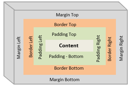
The CSS box model is essentially a box that wraps around every HTML element.

It consists of: margins, borders, padding, and the actual content.

Explanation of the different parts:

  • Content – The content of the box, where text and images appear
  • Padding – Clears an area around the content. The padding is transparent
  • Border – A border that goes around the padding and content
  • Margin – Clears an area outside the border. The margin is transparent

The box model allows us to add a border around elements, and to define space between elements. 

div {
  width: 300px;
  border: 15px solid green;
  padding: 50px;
  margin: 20px;
}

Width and Height of an Element

In order to set the width and height of an element correctly in all browsers, you need to know how the box model works.

Important: When you set the width and height properties of an element with CSS, you just set the width and height of the content area. To calculate the full size of an element, you must also add padding, borders and margins.

Example

This <div> element will have a total width of 350px: 

div {
  width: 320px;
  padding: 10px;
  border: 5px solid gray;
  margin: 0;
}

Here is the calculation:

320px (width)
+ 20px (left + right padding)
+ 10px (left + right border)
+ 0px (left + right margin)
= 350px

The total width of an element should be calculated like this:

Total element width = width + left padding + right padding + left border + right border + left margin + right margin

The total height of an element should be calculated like this:

Total element height = height + top padding + bottom padding + top border + bottom border + top margin + bottom margin